2. Introduction (E-E-A-T & Engaging Hook)
Color is the single most powerful element in interior design, dictating mood, temperature, and visual flow. But choosing the right combination and knowing how much of each color to use often feels like guesswork. Do you put the bright blue on the wall or just in the pillows? The truth is, top designers don’t guess—they rely on a proven, mathematical framework called the 60-30-10 Rule. This simple, universal formula ensures that your color palette is always balanced, harmonious, and professional. As a color specialist, I find this rule indispensable. It removes the stress from color selection and guarantees a stunning result every time. This guide breaks down The 60-30-10 Rule into its three core components, showing you exactly how to distribute your dominant, secondary, and accent colors flawlessly in any room, from the kitchen to the bedroom.
Understanding the Blueprint: What is the 60-30-10 Rule?
The 60-30-10 Rule is a proportional framework for distributing color in a space. It dictates that your chosen color palette should be split into three ratios:
| Ratio | Percentage | Role in the Room | Visual Purpose |
| Dominant Color | 60% | Walls, large furniture (sofa), area rug, ceiling. | Creates the backdrop and establishes the mood. |
| Secondary Color | 30% | Curtains, accent chairs, bedding, secondary furniture (cabinets). | Adds contrast, dimension, and depth. |
| Accent Color | 10% | Throw pillows, art, accessories, lamps, decorative objects. | Provides visual pop, energy, and focal points. |
The Power of Balance
E-E-A-T Insight: The rule works because the 60% provides grounding, the 30% provides visual interest, and the 10% provides the necessary excitement. This proportion mimics how colors are distributed naturally in the environment, which is highly pleasing to the human eye.
Applying the 60% Dominant Color
The dominant color is the anchor of the room and is usually the most neutral or subdued color.
Where to Place the 60%
Walls: This is the easiest way to achieve 60%. If your walls are a light neutral (white, beige, light gray), that is your dominant color.
Floors: The majority of the floor space, typically covered by a large area rug or the flooring material itself, contributes to the 60%.
Large Upholstery: Your largest piece of furniture (the sectional sofa, the dining table) usually falls under the 60% to ground the space.
Choosing Your 60%
Rule of Thumb: Your 60% should be a color you can live with every day without fatigue. It should be the lightest or most neutral color in your palette.
Pro Tip: In small rooms, matching your 60% wall color to your 60% large sofa color can make the room feel larger by blurring the lines between the wall and the furniture. (Internal Link: Link to the ‘Curtains for Low Ceilings’ post on monochromatic blending).
Applying the 30% Secondary Color
The secondary color adds sophistication and often introduces a different tone or temperature than the dominant.
Where to Place the 30%
Curtains and Window Treatments: These are large columns of color, making them perfect for the 30% ratio.
Accent Furniture: Pieces like accent chairs, a painted bookshelf, or kitchen island cabinets.
Bedding: The duvet cover, main bedspread, or bed skirt are excellent ways to introduce the secondary color.
Internal Link: [Anchor text: “design trick revealed” to the Home Decor post on using paint to define space and add drama].
Choosing Your 30%
The 30% should relate to the 60% but provide enough contrast to stand out. If your 60% is light gray, your 30% could be a darker tone of gray, a rich navy (a cool contrast), or a muted terracotta (a warm contrast).
Goal: The 30% color is what provides the room’s character without becoming overwhelming.
Applying the 10% Accent Color
The accent color is the room’s jewelry—the punch of color and energy that ties everything together.
Where to Place the 10%
Small Accessories: Throw pillows (the main delivery vehicle for 10%), decorative objects, vases, candles, and lampshades.
Art: The colors in the accent art should repeat the 60% and 30% colors, with the 10% color providing the final highlight.
Unexpected Spots: The interior of a bookshelf, the finish of picture frames, or a single painted console table.
Choosing Your 10%
The 10% color should usually be a bold, saturated, or bright color—it can be the most fun color in your palette.
Repetition is Key: Do not clump all 10% items in one spot. Scatter the accent color in at least three different spots around the room to encourage the eye to move and reinforce the palette (e.g., a pillow on the sofa, a vase on the console, and a color in the art).
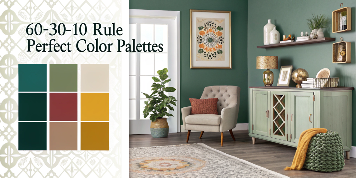
Practical Application Example: A Living Room Palette
| Ratio | Color Choice | Placement Examples | Total Room Percentage |
| 60% Dominant | Creamy White / Light Beige | Walls, large sofa, ceiling, trim. | 60% |
| 30% Secondary | Deep Forest Green | Accent chairs, curtains, painted console table. | 30% |
| 10% Accent | Marigold Yellow / Brass | Throw pillows, decorative glass vase, lamp base, hardware pulls. | 10% |
E-E-A-T Authority: The Multi-Tonal Palette
The 60-30-10 Rule is a guide, not a dictator. You can use two tones within each category (e.g., your 60% might be $35\%$ light gray walls and $25\%$ charcoal gray sofa). The goal is the proportional distribution of visual mass, not literal color purity.
Internal Link: [Anchor text: “how to style a console table” to the Home Decor post on styling using varied heights and balance].
4. FAQ Section (Ready for Schema Markup)
Q: Can I use two different 10% accent colors?
A: Yes, but keep the combination simple. You could use $5\%$ Marigold Yellow and $5\%$ Coral Pink. Both should be energetic colors, and they should be distributed equally around the room to prevent visual clutter.
Q: Does furniture wood tone count in the 60-30-10 Rule?
A: Yes, wood tones absolutely count, usually falling under the 30% secondary color category, especially if they are large pieces like bookshelves or a dining table. Consider the wood’s underlying tone (red, yellow, or neutral) when choosing your paint colors.
Q: My walls are already a bold color. How does that work with the 60-30-10 rule?
A: If your walls are the bold color, they become your 60%. Your secondary color (30%) must then be a neutral (like white or beige) to ground the space, and your accent color (10%) should be a vibrant shade that complements both (e.g., 60% deep blue walls, 30% white furniture, 10% saffron yellow pillows).
Q: How do I incorporate texture using this rule?
A: Use texture to introduce the color. For example, your 30% secondary color can be used in the texture: a smooth, forest green accent chair, a textured, chunky knit forest green throw, and sheer, linen forest green curtains. The variety in texture adds depth.
Q: Where should the color repetition start?
A: Start with an inspiration piece—a rug, a piece of art, or a pillow you love. The 60-30-10 palette should be derived from the colors already present in that single inspiration piece.
Q: Should the ceiling be included in the 60%?
A: Yes. If the ceiling is white and the walls are white, the ceiling is part of the 60%. If you choose to paint the ceiling a bold color, it becomes part of the 30% or 10%, depending on the size of the room and the visual weight of the color.